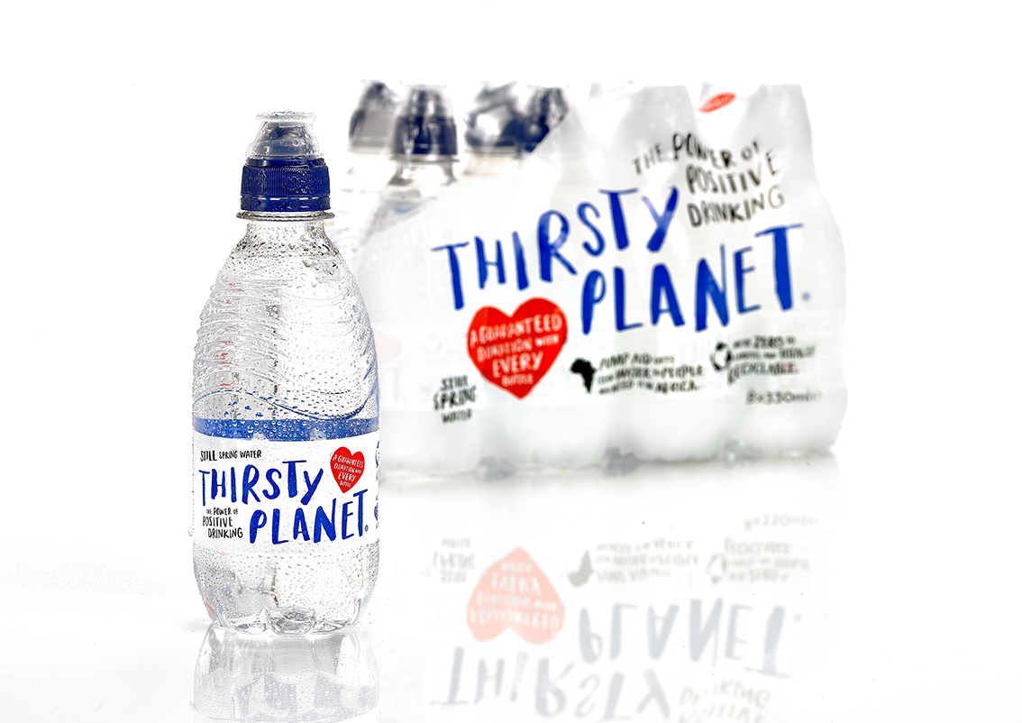
HOW DESIGN TURBO-CHARGED A CHARITY BRAND
When sales of one of the UK’s leading charity waters began to stall despite a buoyant market the brand turned to design to bring about a reversal of fortunes.
Thirsty Planet, part of Harrogate Water Brands, appointed Thompson Brand Partners of Leeds to revitalise the brand, with a brief to increase sales and charitable contributions by 20 per cent, while ensuring no rise in the cost of production.
The astonishing results for 2017/18 compared to the previous year speak volumes for the importance of investing in effective design to make a real difference.
Sales of Thirsty Planet grew by 38 percent, compared to market growth of seven per and donations to charity jumped by 64 percent.
The achievement has been recognised with the presentation of a prestigious Silver Award at the Design Business Association’s annual Design Effective Awards 2019. The awards recognise the compelling influence of design on the success of a business. Crucially, the impact of design is evidence-based, measured and verified.
Thirsty Planet was launched in 2007 and every bottle sold provides a guaranteed donation to independent British charity Pump Aid, which works to achieve lasting positive change in sub-Saharan Africa by working with local communities and improving the quality, availability and use of water and sanitation through innovative and sustainable solutions.
Brand manager Nicky Cain said: “A guaranteed donation with every bottle sold means that shoppers know that they have made a positive contribution and a measurable difference with every purchase. This transparency provides much greater certainty to Pump Aid. It’s the only model which allows the charity to plan a cost-effective delivery programme.
“The previous packaging design depicted an African scene with images of animals and trees. While this was seen as warm and innocent, it was not connecting with the core customer base of 18 to 40- year-olds with a female bias.
“We believed the brand had the potential to bridge the gap if we could make it more contemporary and cooler. We wanted to be relevant without being preachy and we wanted to be seen as more optimistic and grown up.”
Ian Thompson of Thompson Brand Partners explains: “After listening to customers, it was apparent we needed to be clearer about what Thirsty Planet stands for, with clear messaging. We needed to be serious but not earnest; fun but not frivolous. So, we created a friendly, campaigning message board which gives the brand a strong personality and an identity that extends well beyond the packaging.
“We built a new positioning for the brand, with a stronger strapline: ‘The Power of Positive Drinking’. This gives the brand much greater confidence and an attitude it could clearly deliver on with a clear benefit to the consumer. By drinking Thirsty Planet, you are actively demonstrating your commitment to providing vital, safe water sources for people who need it and making positive change through small actions.
“Working within the constraints of the existing label size, we used a hand-painted, illustrative style of typography and iconography, for maximum shelf impact and differentiation. A simple, bold colour palette ensures stand-out, and helps ensure consumers do not see the bottle as being extravagant or wasteful.”
In addition to the main strapline, each bottle informs consumers of the guaranteed donation, the total donated to date, how the money is spent and additionally that Thirsty Planet is zero to landfill and the bottle is totally recyclable.
To date, Thirsty Planet has now raised £2.2 million for Pump Aid. For every £1 donated, 90p is spent by Pump Aid on water delivery in Africa, compared with a UK average for small charities of 60.7p.

