Enhancing Your Graphic Design Workflow with Stacked Monitor
Every graphic designer’s dream is to be able to express their creativity in the best way possible. But this also comes with ensuring you attain a high level of productivity and efficiency. Luckily, this is where a stacked monitor setup comes in handy.
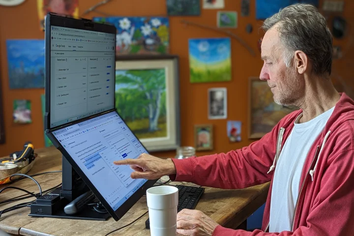
The ability to juggle tasks and enjoy plenty of screen space can really give your workflow a significant boost. But the benefits extend far beyond the sheer magnitude of screen real estate. Using a Mobile Pixel Geminos stacked monitor setup unlocks the gates of exploring several other features that make designing a lot more effortless. If you’re still unsure whether or not to add this monitor to your workspace, this article is for you.
Continue reading to find out!
Larger Screen Canvas
As a graphic designer, you possess an innate desire to push boundaries, and create stunning visuals that leave a lasting impact. This creative expression is what makes you and your clients happy. And in this quest for design excellence, every tool at your disposal becomes a brushstroke on the canvas of your imagination.
The typical single-monitor setups somehow limit the amount of space you have. As a result, you will find yourself constantly zooming in and out or switching between different windows. However, this isn’t the case with a stacked monitor setup.
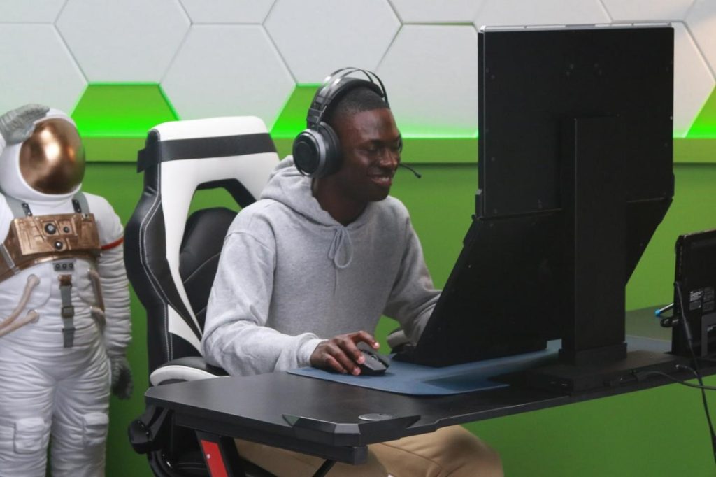
Using this tool allows you to have multiple applications or design files open at once, each with its own dedicated screen. This lets you have a complete view of your work, making it easier to compare and reference different designs. Picturing this setup alone gives you a clear idea of how having a separate screen comes in handy.
Higher Multitasking Efficiency
Gone are the days when you have to constantly experience the hassle of switching between apps every now and then. Having stacked monitors has become a game-changer for multitasking. Now you can simply have your design tools and materials displayed in front of you.
As a graphic designer, there are times when you need to work on various aspects of a project simultaneously. For instance, you might be creating vector illustrations while referring to a mood board or tweaking typography while previewing the design in a web browser.
Working on such a task would ideally involve constant navigation. But you can find a way around this. A good option to solve such a repetitive process is having a stacked monitor.
That way, you can have different tools and references right in front of you without cluttering your workspace. You wouldn’t have to constantly minimize or resize windows which streamlines your workflow and reduces distractions.
Effective Use of Vertical Space
Any graphic designer would be aware of the fact that this skill typically involves working on projects with different aspect ratios. This usually varies depending on the kind of task at hand from designing banners to social media graphics, or infographics. Many graphic designers are aware of the need to have a clear view of the project at hand.
Luckily, stacking monitors vertically can help you view and edit designs in their intended aspect ratio without any cropping or reducing image quality. You will find this quite useful when working with long or vertically-oriented designs.
This will allow you to see the entire composition at once. If there are any inconsistencies or errors in your work, you’ll easily spot them. With a single glance, you witness the entirety of your vertical masterpiece. So, you can easily express yourself and detect any flaws in your designs.
Better Graphical Presentation
Many graphic designers are usually in positions where they have to make a presentation on a particular topic. Situations like this mean you need to have tools that help project your ideas perfectly. Whether you’re presenting to a group of clients or a team, you need effective communication.
And this is where having stacked monitors prove quite useful. You can have one monitor decided for designs, while you keep another open for PowerPoint slides or other references. There would be no need for frequent switching between tabs.
You can simply have everything well organized and readily accessible. At the end of the day, everyone involved can easily view and interact with the necessary information presented.


