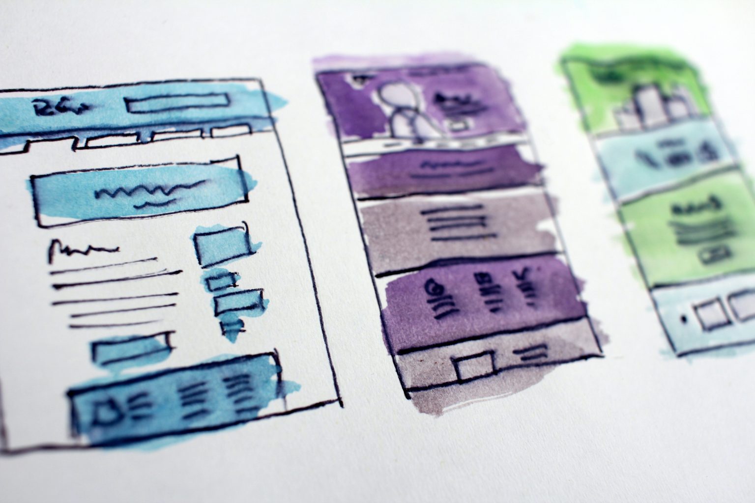
When it comes to building a website, there are a few key principles of web design that you need to think about. Lots of people don’t know this, but the best web developers tend to follow a series of principles when building a website, and this is why so many big companies have successful sites that help them to sell products and generate leads.
As website designers Liverpool, we try to operate using these design principles wherever we can because they have been proven to be effective. However, because we want you to understand what it is we are trying to accomplish, we’re going to talk about the design principles for a good website.
The first important web design principle you need to think about is balance.
The reason why so many websites look fantastic is that they understand the concept of balance. Basically, you want to add symmetry to the website. You can do this in two different ways because there are two different types of symmetry.
Symmetrical websites have an even split between two halves. The left half and the right half of the website are nearly identical to each other. This could be the top half and the bottom half as well, but the basic principle is the same.
Of course, asymmetric websites still use balance, but the website itself is not equal on both sides. Sometimes the top section of the website is more graphic-focused, and other times one section has more text. However, the overall design of the website is still balanced, which is useful.
When you’re building a website, it’s important to make sure that you have a lot of empty space on the site. This may sound like something of a contradiction, but it’s actually important for creating a cohesive, engaging website.
Having empty spaces on the website allows visitors a chance to stop and collect themselves. It also means that they can take a look at what they’ve just read and hopefully be more engaged with it.
Moreover, empty space on the website allows you to draw attention to the important parts of the site. If there are masses of text and graphics all over the site, then it’s hard for customers to work out what’s important.
Generally speaking, most websites are built using a grid system. This process takes a page and splits it up into different sections to make sure that everything is aligned.
The net result is that the site looks much cleaner and balanced. Everything is where it should be, and obvious design errors are avoided. This type of thing can be very important for a successful site.
Colours are an important part of any successful website. The types of colours that you use will have a big impact on the overall appeal of your website because different colours create different feelings and thoughts in people. For example, the colour red is associated with passion, desire, and excitement. It’s a bold, loud colour, and this means that people pay attention when they see it.
Savvy web designers can use this to their advantage by creating a colour palette, which complements itself, and allows you to draw attention to certain parts of the website by using different colours.
Lots of people respond well to a striking visual design on a website.
The use of infographics, videos and other pictures has become very popular as a way of communicating information quickly. Furthermore, most people don’t want to read large amounts of text and respond better to photos and videos than they do walls of content.
Descriptive imagery is a good way to achieve this because it helps you to support text and communicate information at the same time. With this in mind, there are two primary considerations to think about with graphics and video content. First of all, limit the usage of larger images in places where visitors first appear on the site. You don’t want to overwhelm somebody with a photo before they can start looking around. Second of all, make sure that photos load quickly because graphics that aren’t working properly will make users more likely to leave the site.
Typography is a very important part of any website. The different fonts and text sizes that you use will have an impact on how well your website is received.
You need to make sure that you pick the right-sized text to help readers view the content without making it difficult to read. Generally speaking, the main body copy is supposed to be 16px.
Other big considerations include things like keeping an eye on font legibility. If you’re going to include a font, and needs to be easy to read and in a sensible colour. Cursive, flowing handwriting-style fonts are not recommended for businesses.
Consistency is the most important thing for any website. The website needs to look the same throughout the site, and every page needs to work at a consistent speed and have the same features. Consistency is one of the most important parts of any successful web design, and it’s something that any good developer will tell you.
So, when it comes to web development, these are some of the most important things to keep in mind. Web development is an ongoing process, and building a good website requires experience and wisdom. Generally speaking, as experts in web design Manchester, we try to keep to these key principles.
Websites Preston all follow a basic structure because this is typically the industry standard for the construction of any website. There needs to be a certain level of technological sophistication, so most of us commit to building websites in a pretty similar way, but the real strength of each developer comes through the way that they optimise the different parts of a site. In this way, no, two websites are ever completely alike, which means you can put your own unique spin on your website.

